Update #6, v0.6.1c, beta hot fixes and UI tweaks
By the Gods, this was a mighty struggle! The beta threw some really devious bugs my way, but at last I am uploading a patched up version :)
To be fair, I wasn’t in a very good shape after initial crunch, so it might explain why I have taken a bit longer than expected to upload the hotfix version. Then, one bug really had the best of me for a whole day - it was so infuriating I even tweeted about it, though in truth I feel a bit humiliated by it... Jeez.
Anyway, here is the changelog for v0.6.1c:
Main:
♦ Enabled no-video option for menu and load screen
♦ Fixed the emitter searchImage bug that killed the game
General Fixes:
♦ Tooltip formula parsing for skills and classes now works. Usually.
♦ Icon size auto-adjustment removed (my brother's 4k monitor really didn't like that)
♦ Stamina will never be reduced by Difficulty (otherwise, Avatar is still unbeatable! :))
General UI
♦ Added ConfirmationPanel to make sure you know what you’re doing sometimes...
♦ Fixed Quick Info item in game menu, now you can view manual from in-game!
Inventory UI:
♦ New looks and feel for inventory
♦ Added controls and other info
Info Text on drop and failed operations
♦ Safe atlas fail for Next Floor - should never fail to load now
Content
♦ New Scenario - Demo Bonus, with 3 of the darkest dungeons!
♦ New Hero - Demo Knight, with flail and shield!
Misc
♦ Revamped Music system - disabled streaming, at least it plays 1 track smoothly now, even if it means loading it all into RAM. Damn if I know how people use streaming properly without getting spikes during resource loading!
Some may have noticed that for some reason steamed music was sounding horribly when things were loading, and to me this is small surprise - if your next bit of sound can be delayed by some heavy file loading, why wouldn’t it sound glitchy and torn?
Maybe I have violated the practice of leaving out all logic/calculation of the graphical thread...
♦ Prototyped undetected cell darkening (doesn't seem to matter due to Block), gonna need to find a different visual solution, but the system is there already.
Some thoughts on the game’s status:
♦ On the whole, the Character Screen (which I call HQ somehow, the Headquarters...) is still very raw, but the system seems genuinely interesting and solid now, I am already kind of able to create heroes there already, which is much faster and simpler and easier to balance than just by inputting parameters I guess.
♦ I have some way of displaying generic messages now, maybe a kind of tutorial will come out of it, eventually...
And finally, some good news - there might be some better times ahead as far as the art is concerned! I think I have found a good artist who is willing to work on the project despite my limited budget!
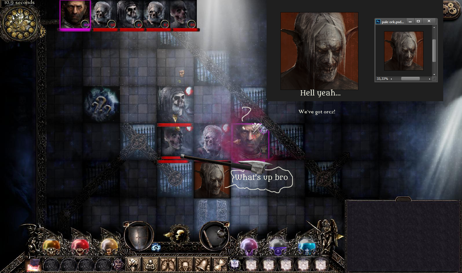
Here is his first work - a black orc from mordor the darkest caverns beneath Ersidris!

I still didn’t have time to do anything about the art myself though. But one day...
Stay tuned, I'm entering a new development cycle, there will be blood and glory! :)
Eidolons: Netherflame
A Dark Tactical Roguelike/cRPG with deep Hero Customization, Random Dungeons, gripping Story and a harrowing Atmosphere
| Status | In development |
| Author | EiDemiurge |
| Genre | Role Playing |
| Tags | 2D, Character Customization, Dark Fantasy, Fantasy, Roguelike, Tactical, Tactical RPG, Top-Down, Turn-based |
More posts
- The Backer demo is out , watch the first half, then play it in full!Sep 25, 2019
- §28 - CROWDFUNDING CAMPAIGN IS LIVE! :)Sep 18, 2019
- §27 - the Netherflame campaign has begun!Jul 20, 2019
- §26 - Back in the fray, with new plans and ideas!Jul 04, 2019
- §25 - The crunch is over, the Demo's testing is now, and the crowdfunding ... D...Jun 04, 2019
- §24 - The Demo crunch, the first Boss, many new things and... another delay :)May 14, 2019
- §23 - A Demo, An Interview, and a little delayApr 23, 2019

Leave a comment
Log in with itch.io to leave a comment.