Update #4: V 0.5.9 - Hero Menus and Brand New Video
Version 0.5.9
The version update has been delayed by internet cut, Siberia is a rough place to live! But as you can guess, this only made me work all the harder (I do sometimes wonder if I should automate my network to go down regularly with no easy way to restore it...).
Now, to business:
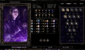
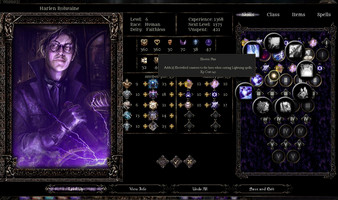
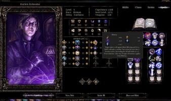
First off, I have finally started to implement the new system design, this time in a more minimalistic way (aka vertical slice). In fact it’s already almost ready for testing, and I might include it in the closed beta yet! Also the overall hero-system design seems to be getting more rigorous and orderly as I am forced to adopt to for the requirements of maximum usability...
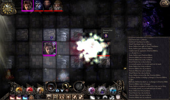
Next, the “look and feel” of the crawling process has been changed I even made a video that showcases it, check it out :)
So as you can see, movement now uses fading animation - I know some of you will say it is weird, but I am experimenting at this point, and somehow I found this to fit the darkly mood and style of the game (everything is *fading mysteriously* in Eidolons, it seems...)
Preparing for the beta, I have added a lot of utility things such as quick access buttons for inventory and spellbook.
On a final note, I’ve had some success in creating image generation utils, that's one unsexy thing that an indie must learn to survive...
Anyway, I’m very excited because the next version if 0.6.0 and that means I will be posting a demo download as per my promise :)
Meanwhile, the closed beta is about to launch already, I’ll be reaching to all of you guys who subscribed to receive it. And don’t worry, I won’t be spamming you with updates and promotions, I’m too busy developing the game :)
Eidolons: Netherflame
A Dark Tactical Roguelike/cRPG with deep Hero Customization, Random Dungeons, gripping Story and a harrowing Atmosphere
| Status | In development |
| Author | EiDemiurge |
| Genre | Role Playing |
| Tags | 2D, Character Customization, Dark Fantasy, Fantasy, Roguelike, Tactical, Tactical RPG, Top-Down, Turn-based |
More posts
- The Backer demo is out , watch the first half, then play it in full!Sep 25, 2019
- §28 - CROWDFUNDING CAMPAIGN IS LIVE! :)Sep 18, 2019
- §27 - the Netherflame campaign has begun!Jul 20, 2019
- §26 - Back in the fray, with new plans and ideas!Jul 04, 2019
- §25 - The crunch is over, the Demo's testing is now, and the crowdfunding ... D...Jun 04, 2019
- §24 - The Demo crunch, the first Boss, many new things and... another delay :)May 14, 2019
- §23 - A Demo, An Interview, and a little delayApr 23, 2019
Leave a comment
Log in with itch.io to leave a comment.